From sign-up to first trade, in one continuous flow
Clear Street Active is a retail trading platform for equities, options, futures, crypto and prediction markets. In a 4-hour take-home, I redesigned the journey after a new user creates their login: completing the trading application, funding the account and placing a first trade. I used AI to explore fast, then took over the decisions that build trust.
The form isn't the problem. The experience around it is.
A user has created their login. The product now needs to get them to finish the trading application, fund the account and place a first trade. The brief asked for more than a form: how the product gets someone to take each step, what it says before and after, and how it earns enough trust for someone to connect a bank account.
Trade often, know what they're doing, and want speed and control.
More deliberate, expect a premium experience, and need more trust before moving large amounts of money.
An AI-assisted process, with a designer in charge
With only four hours, I used AI to get to a complete first draft quickly, then spent most of my time judging, cutting and refining. The Figma file keeps that history visible: the original AI-generated flow is preserved as it was first generated, followed by my iterations and final flow.
- Audit
Walked the current app end to end and sorted every field and prompt from 37 screenshots.
Designer - First draft
Generated a complete end-to-end flow with AI, then annotated what worked and what didn't.
AI-generated - Iterate
Explored variants for identity, agreements and funding, comparing them side by side.
AI + designer - Refine
Chose the final flow, wrote the trust copy, and built the components and reward visual.
Designer
- Producing a full end-to-end first flow in minutes
- Generating several layout variants for the same step
- Moving fast on screens that follow familiar patterns
- Deciding what to keep, defer, hide or cut
- Regulatory judgment calls and what to flag for compliance
- Trust and expectation copy at every money moment
- Visual polish, components and the reward visual
37 screens, sorted into four verdicts
I mapped the existing flow, from the welcome screen through account creation, identity, employment, agreements, market data and funding. Then I sorted every field, prompt and screen by whether it was really needed to open and fund an account.
Key takeaways
- Move suitability questions (experience, income, net worth, objective) out of the deposit path, and ask at margin or options upgrade.
- Fold market data into the account agreements, so the checklist drops from 4 steps to 3.
- Cut friction screens: confirm password, the scroll gate, the forced agreement tap, and "all set" dead ends.
- Hold the notification prompt and the AI assistant intro until after the account is open.
- Prefill or derive what we can: tax residency, employer country, source of funds and address fields.
Regulatory needs vary by account type, so every verdict was marked to validate with Clear Street compliance.
Getting to a full flow fast
The first end-to-end flow came from AI, kept as generated, with my annotations. It set the structure the final design kept: Get started → Verify identity → Agree & open → Fund & first trade.
Exploring variants, then choosing
I explored identity verification with segmented progress, a form style, minimal pagination and a plain deposit step. For funding, I tried a new visual style, a separate payment-method step and a conversational pattern. The conversational pattern won: one question at a time, with tappable answers that stack as you go.
One continuous path to a funded account
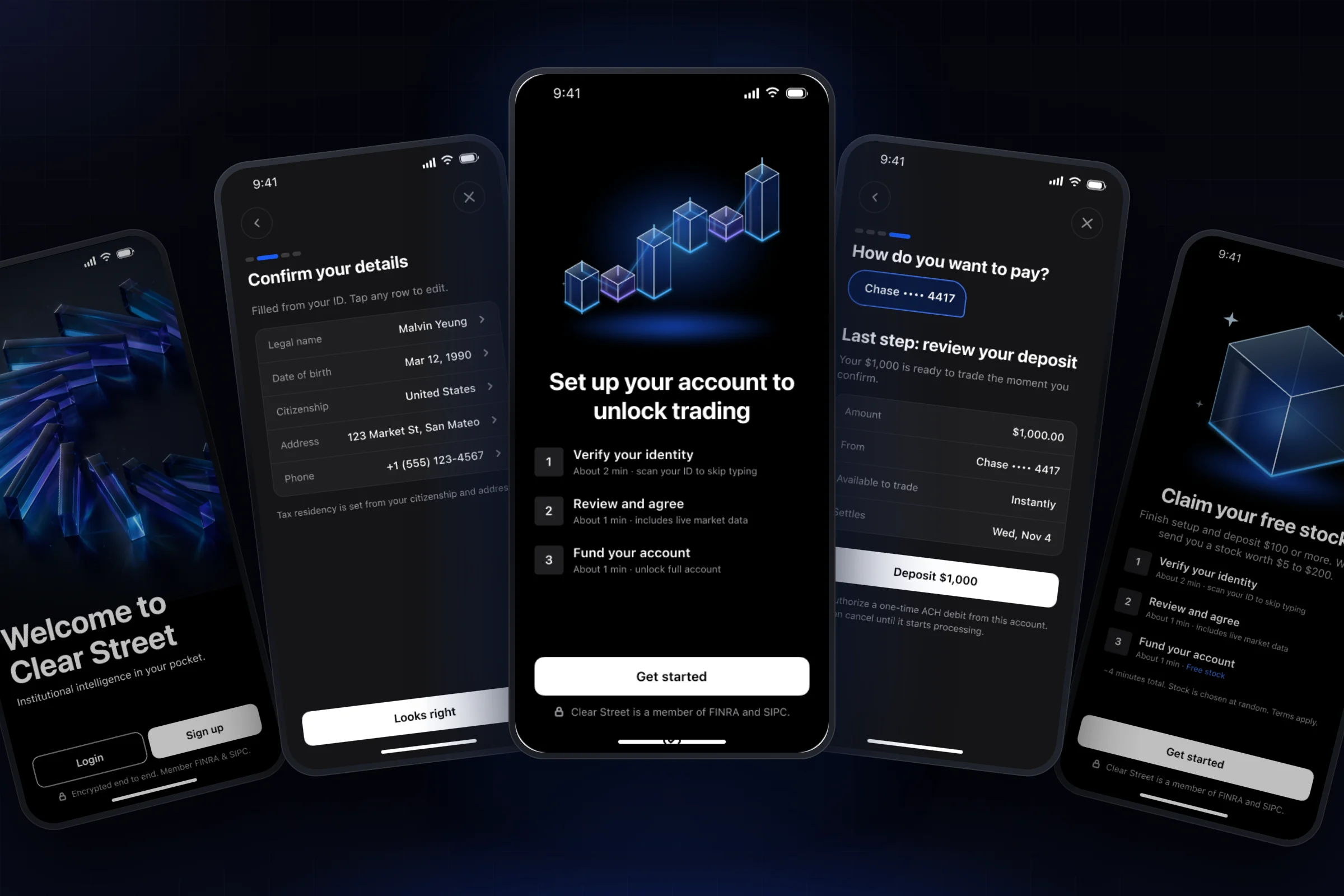
The final happy path is a single, conversational flow with a 4-segment progress bar. Every money moment says what happens next and when.
Create account
Email and password only, with a show/hide toggle instead of a confirm-password field. Native sign-up replaces the web-auth system prompt that read like a security warning.
Verify identity
Scanning an ID prefills name, date of birth and address, replacing about five typed screens with one review. The SSN screen carries the strongest trust copy. Employment asks one question at a time, and employer fields appear only when they apply.
Agree & open
A one-tap market data question replaces a 10-question professional status survey. One agreement screen covers the account and market data, each with a plain-language summary. While the account opens, the app asks to link a bank, so the wait isn't wasted.
Fund & first trade
Preset amounts, clear fees by payment method, and a review screen that says exactly when the money is available to trade and when it settles.
A home screen that always names the next step
The setup checklist is the re-entry point. It shows the same screen at each stage, ticks off finished steps, and changes the button to name the next action. A free-stock version ties the deposit to a reward and counts down the time left.
Components built to scale the flow
I built local components to match the existing app, bound to Clear Street's dark color variables: the onboarding header with segmented progress, buttons, inputs, answer options, detail rows, trust notes and a number pad.
What I'd do next
Confirm each keep, defer and cut verdict for every account type.
Check that active traders can move fast and that wealthy investors find enough reassurance.
Track drop-off at each step, time to first deposit and time to first trade.